Logo Designs
I like to sketch and design logos. My style is simple, geometric, and incorporates or remixes known symbols.
Roundabout
The Roundabout logo is stylized from UK road signs. The spokes are simplified and standardized, and the notch depicts left-hand drive traffic flow. It's rotated 45 degrees compared to a road sign, and resembles the ASCII currency sign ¤.
Figma, 2022
TRC
This logo incorporates my initials in a 2D representation of a 3D shape, imagining as if the letters were built from LEGO bricks. Note the faces of the "bricks" are rectangular, taller than they are wide.
Figma, 2020


Hartford Streets
This logo modifies the silhouette of the Soldiers and Sailors Memorial Arch to depict a pedestrian crossing with two-way traffic and a median island.
Figma and Streetmix, 2015
LDraw.org
The LDraw.org logo symbolizes the representation of a LEGO brick as CAD model. At the time, digital LEGO building was brand new. The only tools available were homebrew and open source, like those in the LDraw system.
POV-Ray, LDraw, and Photoshop, 1999

TRC Logo Design Process
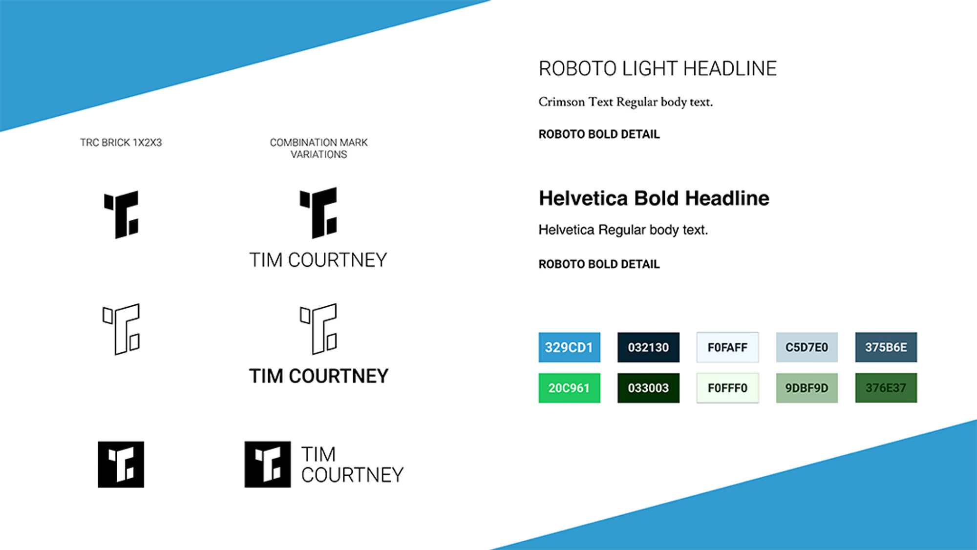
Over the summer and fall of 2020, I set out to create a personal logo and brand identity. I wanted a personal mark or monogram that could translate well across mediums and sizes. For example, I could use it as a brand identity for freelance work, on social media, email signature, or a favicon.
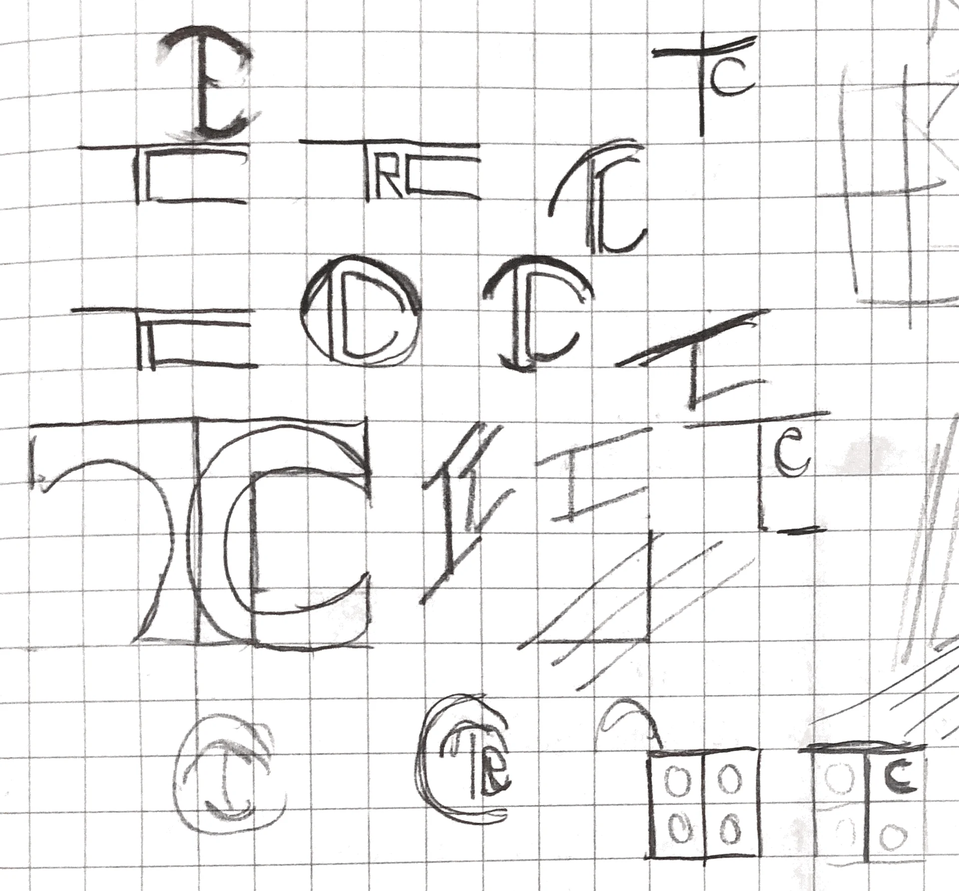
I've long appreciated geometric, clean, modern designs. Though explored a few angles, including variations on classic monograms and borrowing from the style of railroad liveries. I found that my initials TRC, or even TC, challenging to integrate. This led to quite a few potential directions. Blocky or curved, nested, overlaid, in a grid, or in an orthographic layout. I naturally borrowed from LEGO brick geometry and experimented with making that form more or less explicit.
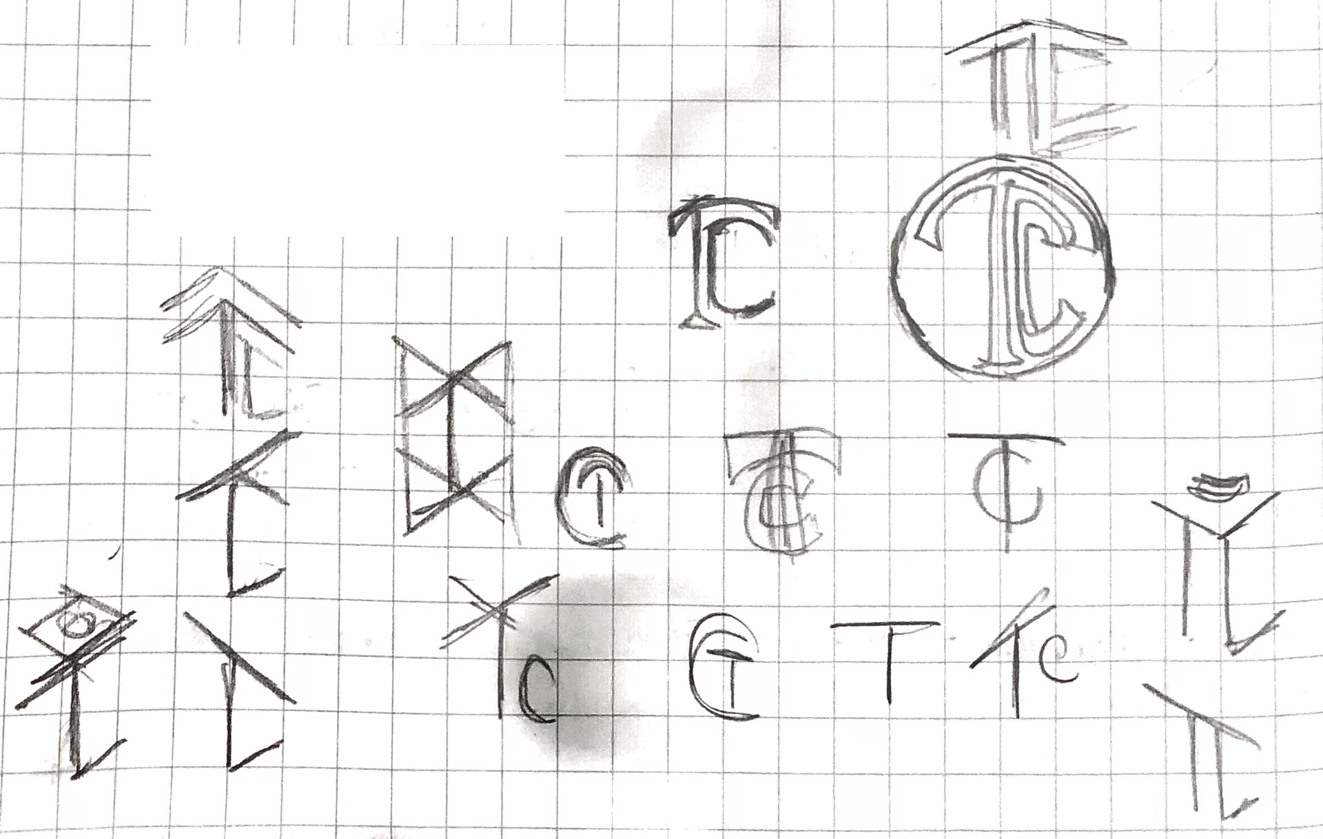

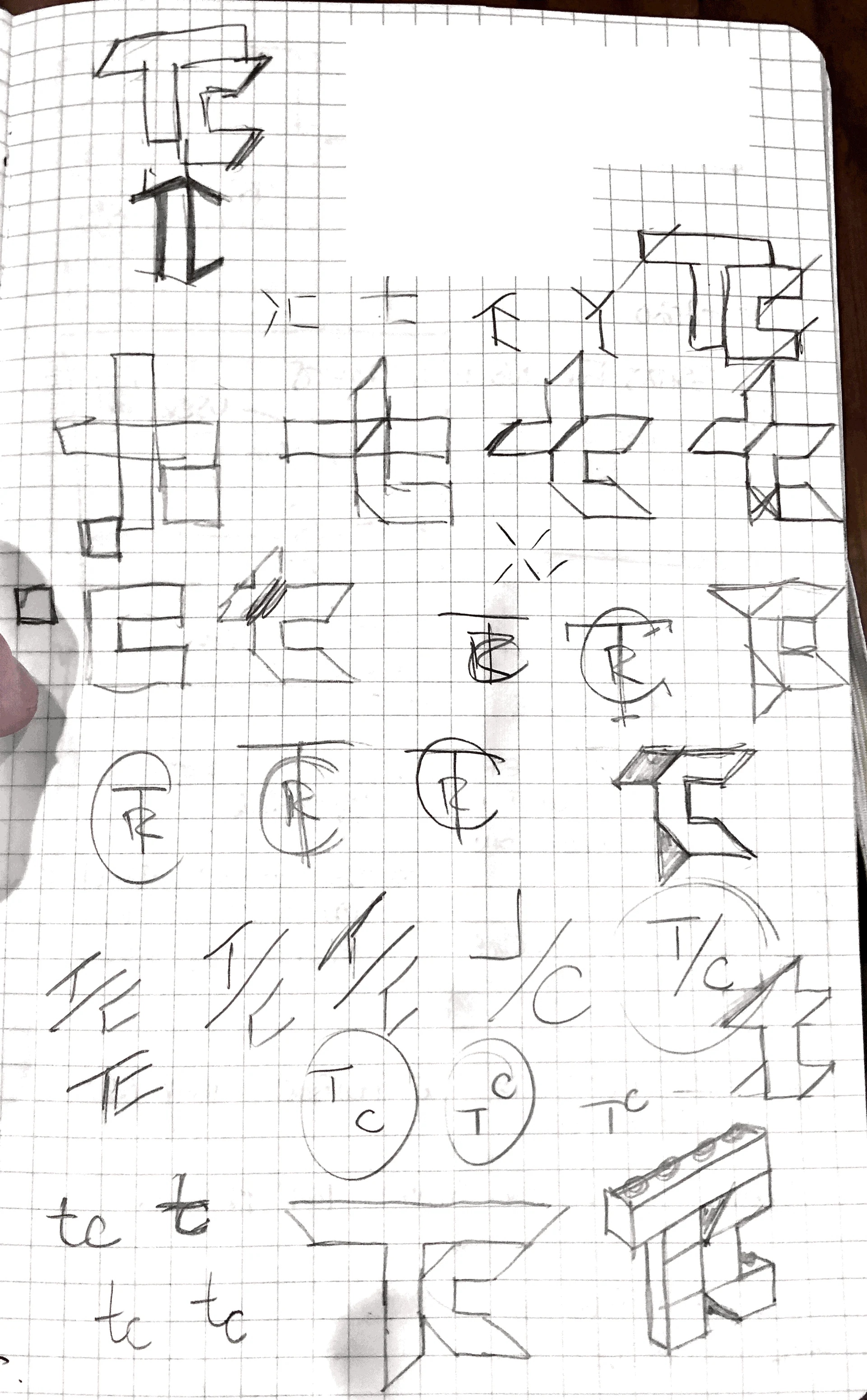
After some sketching, I found myself gravitating toward a blocky TC letterform. Some variants looked too much like the original TechCrunch logo, others invoked a cross. Once I put them into vector format (Figma) and tried various angles, I brought the orthographic LEGO brick proportions back.
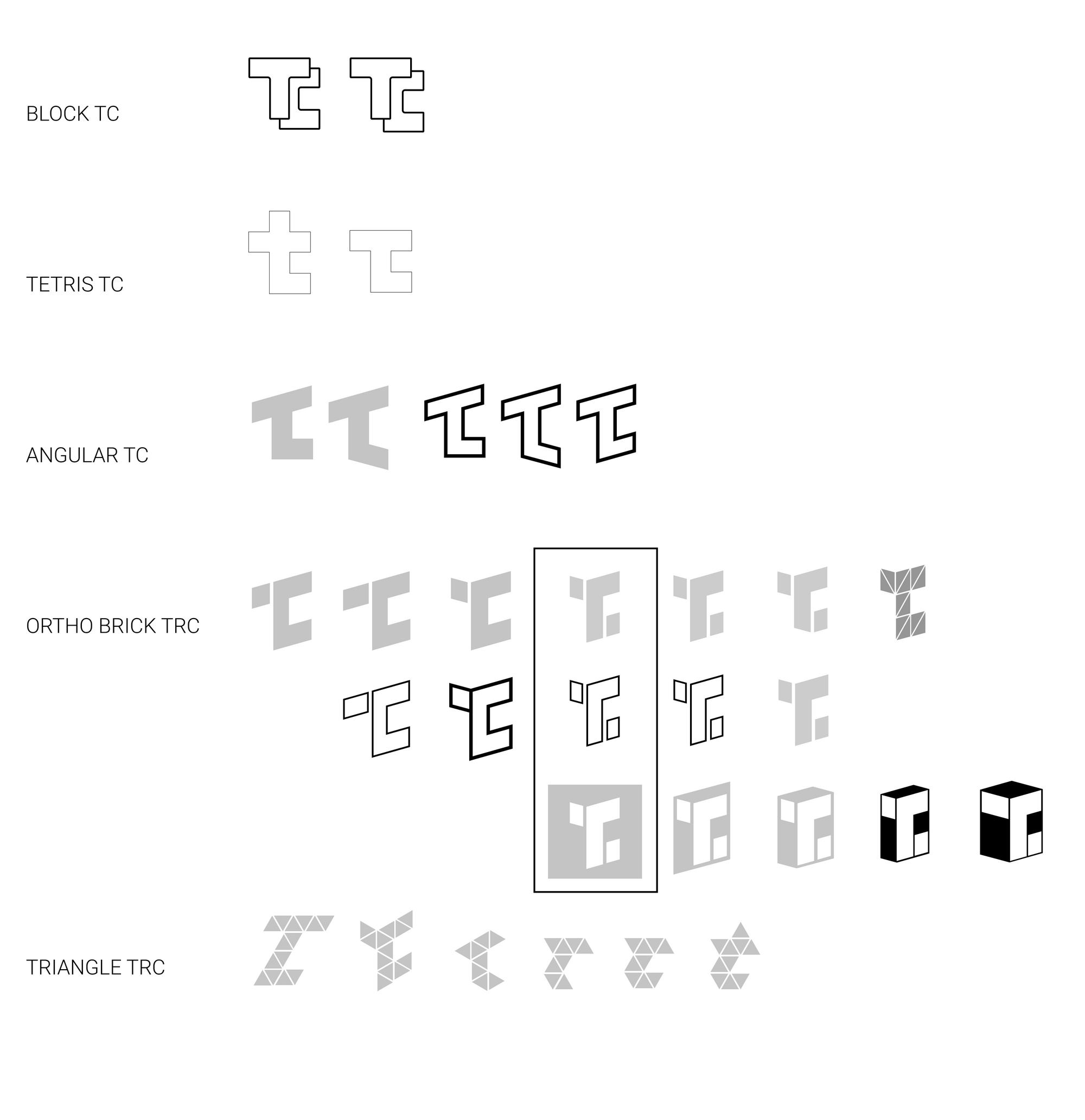
Ultimately I zeroed in on an orthographic TC that nodded to a 1x2 LEGO brick. By separating the left arm of the T and lower right arm of the C, the mark became intersectional and balanced. A lowercase letter R also revealed itself, so the mark successfully depicts all three initials TRC.
I also did explore a triangle alternative. While I really like it, the mind has to make more of a leap. It's not for now, at least.
Finally, I've created block, outline, and alt versions of the logomark and paired it with Roboto Light for the block and alt versions, and Roboto Medium for the outline version.
